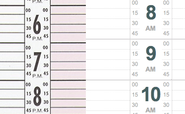
I’ve often wondered why salon appointment books always use such bad stretched numbers for the hours column. For someone interested in typography and graphic design it drives me crazy. I guess it must have started as a way to keep the columns narrow to fit as much on the page as possible, but it must only save a couple of pixels.
You end up with a much more legible and aesthetic result if you just keep the font’s proportions and make the numbers a little shorter.
It’s one of those strange traditions, that I think it’s time to change.